


Samnooshka Designs has been the web-master and designer for C&M Property Services for the last 5 years. Their original website we created for them was great for what they needed but when they approached us wanting a logo re-design, we took the opportunity to also update their website to a more modern design, which is user friendly, not only on PC's but on mobile devices too.

C&M Services Old Website and Logo Design
![]()
The Brief
The logo must be Red and Yellow to match the colours on their new van. They wanted a house featured in the design and an arrow to resemble quick service. The design must be bold and punchy.
What We Did
Following the brief set out by Carole and Michael, here is the final result:
![]()
Of course this didn't match with their old website design, so we gave that a makeover too:


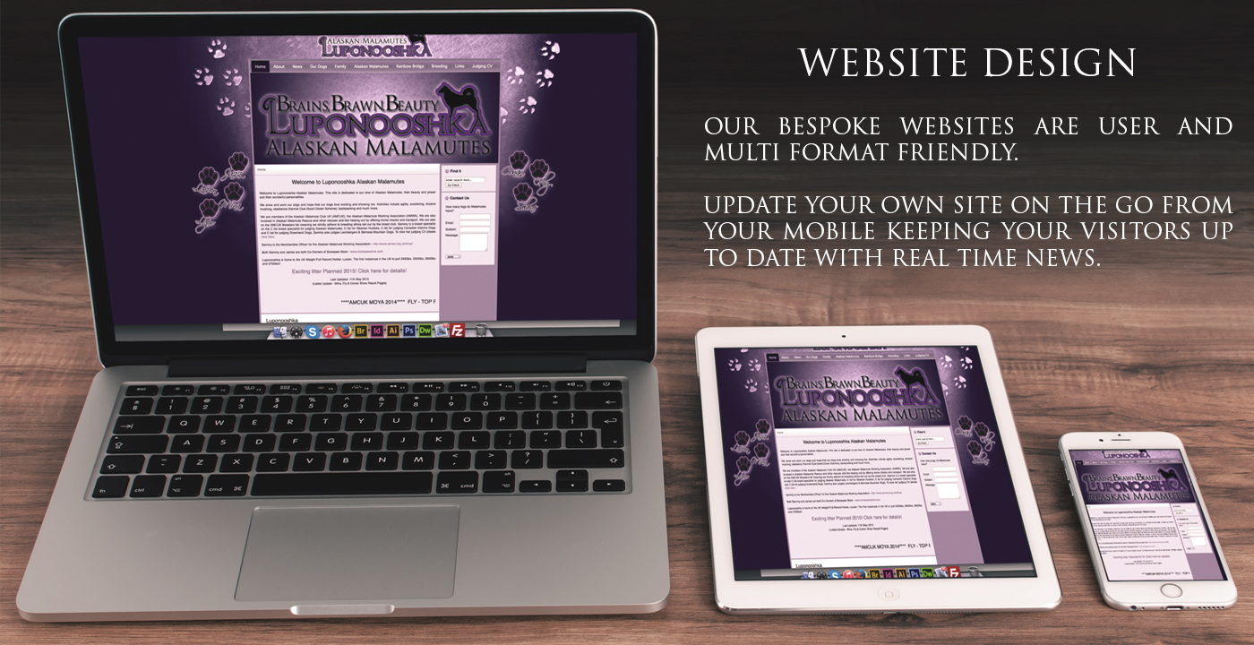
This mobile friendly design features an easy drop down menu, non flash slider images, click to call phone numbers to make it easier to call them and social media share buttons. The new website is sleek and professional, a more grown up design to the one before whilst still retaining all the personal feel to the site and the business that they are known for.