


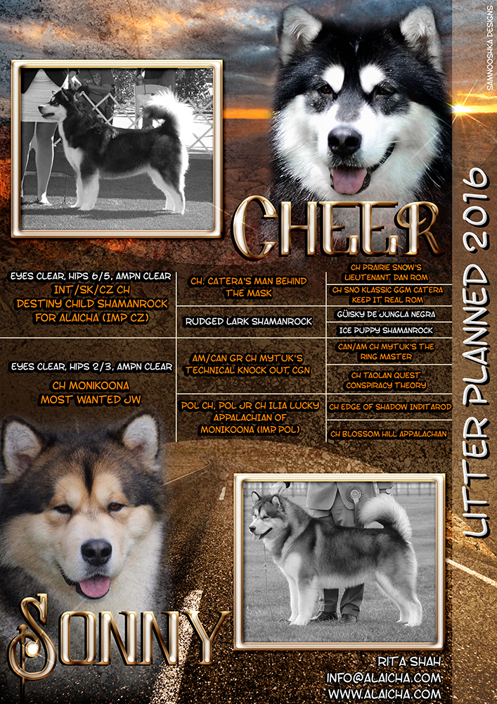
One of our regular customers approached us to do an advert for their upcoming litter in Summer 2016. She wanted a simple, yet stunning advert with simply the dogs and the pedigree but including a sunset.
Here is what we came up with:
Of course, with dogs named Sonny and Cheer we had to have a little fun too ;)
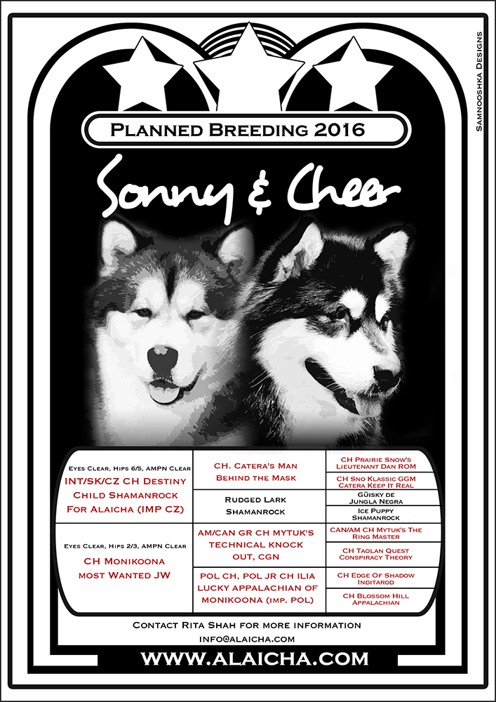
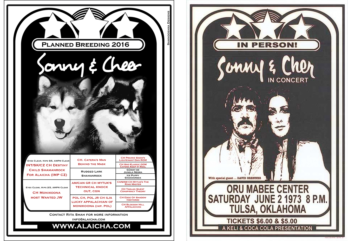
We wish Rita the best of luck with her litter and look forward to seeing the puppies later this year!
I was contacted recently to create some adverts for a fantastic K9 centre in Scotland. They wanted to keep the colour scheme similar to their website and use their logos. To create a poster for a Doggy Cafe morning. To create an advert to go into the local newspapers announcing their open weekend. To create a 2 sided flyer. To create an "Opening Soon" poster for social media.
Keeping everything with the same branding but making the adverts distinct, I came up with these designs. 


Why not pop along to their open day and find out more about them at their new centre in Forfar this weekend and meet Kyle and Miracle - Crufts Friends For Life Winners 2015
Little Owl Pre-School currently have vacancies and are looking for a suitable candidates. If you think you would fit the roles and have what it takes, please view their website (designed by us) for more information. 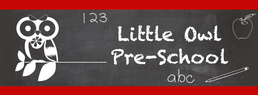
Paul and Lindsey contacted us in December to design a logo to celebrate their new Kennel Affix - SnowRox.
We talked about colour schemes and any ideas they had and "Snow" was obviously a big part of their name and of course blue colours.
Here is the first proof of the design:

After taking their likes and dislikes and going back to the design, here is the final image we came up with:

The design can be used with or without a background depending on what they want it for. We also made up a sparkly GIF for them for when they have their own website.
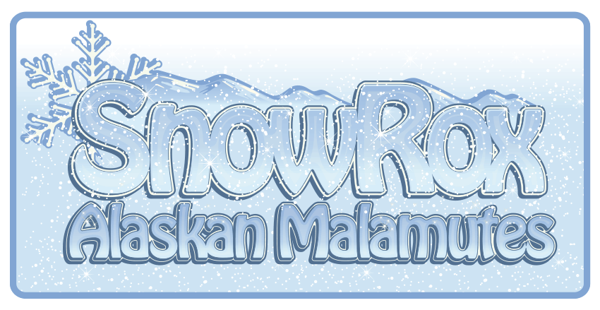
Using their snow theme for their logo, we are delighted to be involved in sharing some exciting news of their expected litter! We wish Lindsey, Paul and Roxy all the best for this fab litter. Good luck!


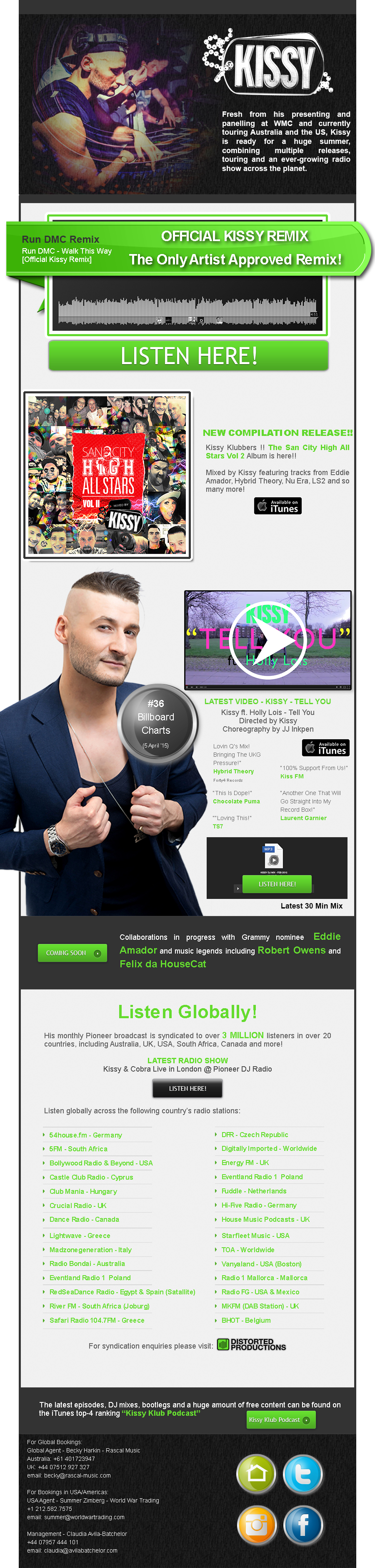
In April I was asked by Kissy's team (San City High) to design an email flyer to showcase his latest single and up-and-coming projects.

I have designed several email campaigns and if you would like me to design yours, then please get in touch for a quote, outlining what your campaign will be about and provide me with all material and wording.
This campaign was designed for use with Constant Contacts.
For the full sized email (images only) click here: Kissy Email!
For more information on Kissy, please visit his website: http://www.sancityhigh.com/
We are delighted to be involved in the designing of Team AMWA/Team GB's logo for the World Sleddog Association race, this year held in Germany.
The logo was originally designed for their trip to Austria in 2015 and we designed the logo to be versatile and easy to change to match the country the team are racing in.
The logo continues to look fresh, and most importantly stands out among the 100s of mushers from many countries that attend.
Good luck to Team GB
2015 Design

2016 Design

Team GB rocking their fleece jackets at the 2015 race in Scharnitz. We can't wait to see this years design embroidered.

Logo development is something that I really enjoy. From the interview to the final finished piece. I was contacted by Cheryl to design a logo for her new business, we discussed the idea over the phone, Cheryl had very clear ideas on what she wanted.
Typical questions I ask when designing a logo are:
1. What is the company name?
2. What is it about?
3. Colour scheme?
4. Colours or features to avoid?
We also have an informal chat so I can get a good feel of your personality and your business.
I like to work closely with my clients so that they get exactly what they need.
This design had to have a horse jumping, just an outline with a skeleton painted on to it. It had to be clean, with tidy lines and using a basic fairly plain font. Inspiration for the design came from Gillian Higgins "Horses Inside Out".
I like to see how designs come together. Here is a sequence of images to show the development of this design.
1. Draft 1 - This horse was too cartoon like.
![]()
2. I gave the client two options of a detailed version and a plain silhouette. The client preferred the plain version, but wanted the horse to be in a more athletic jumping position and the writing needed to be simpler.
![]()
3. I drew a new horse, in a better correct jumping position. He needed to be flipped over to face the other way and the writing added.
![]()
4. Writing added in plain font to give a clean professional feel.
![]()
5. A colour change and heartbeat added and it's all finished.
![]()