Logo development is something that I really enjoy. From the interview to the final finished piece. I was contacted by Cheryl to design a logo for her new business, we discussed the idea over the phone, Cheryl had very clear ideas on what she wanted.
Typical questions I ask when designing a logo are:
1. What is the company name?
2. What is it about?
3. Colour scheme?
4. Colours or features to avoid?
We also have an informal chat so I can get a good feel of your personality and your business.
I like to work closely with my clients so that they get exactly what they need.
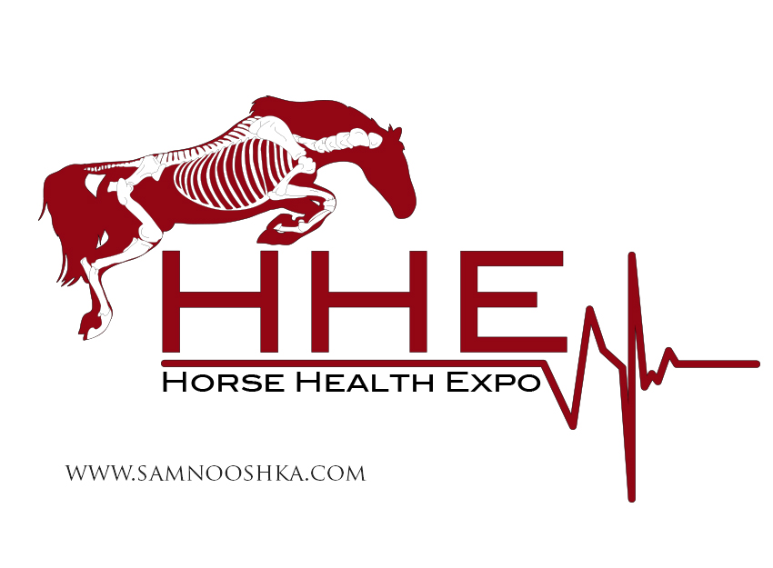
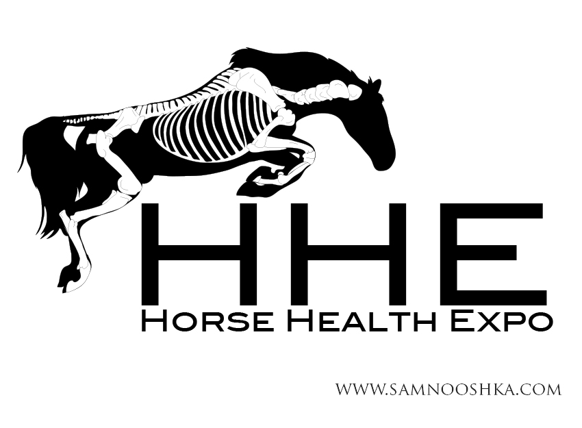
This design had to have a horse jumping, just an outline with a skeleton painted on to it. It had to be clean, with tidy lines and using a basic fairly plain font. Inspiration for the design came from Gillian Higgins "Horses Inside Out".
I like to see how designs come together. Here is a sequence of images to show the development of this design.
1. Draft 1 - This horse was too cartoon like.
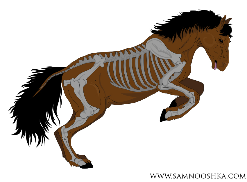
2. I gave the client two options of a detailed version and a plain silhouette. The client preferred the plain version, but wanted the horse to be in a more athletic jumping position and the writing needed to be simpler.
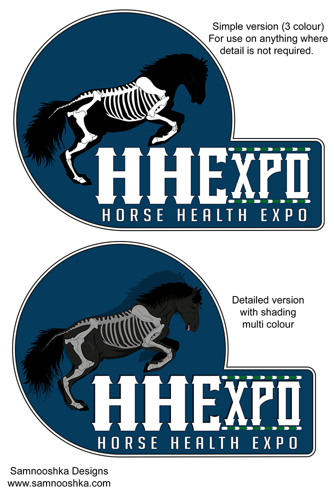
3. I drew a new horse, in a better correct jumping position. He needed to be flipped over to face the other way and the writing added.
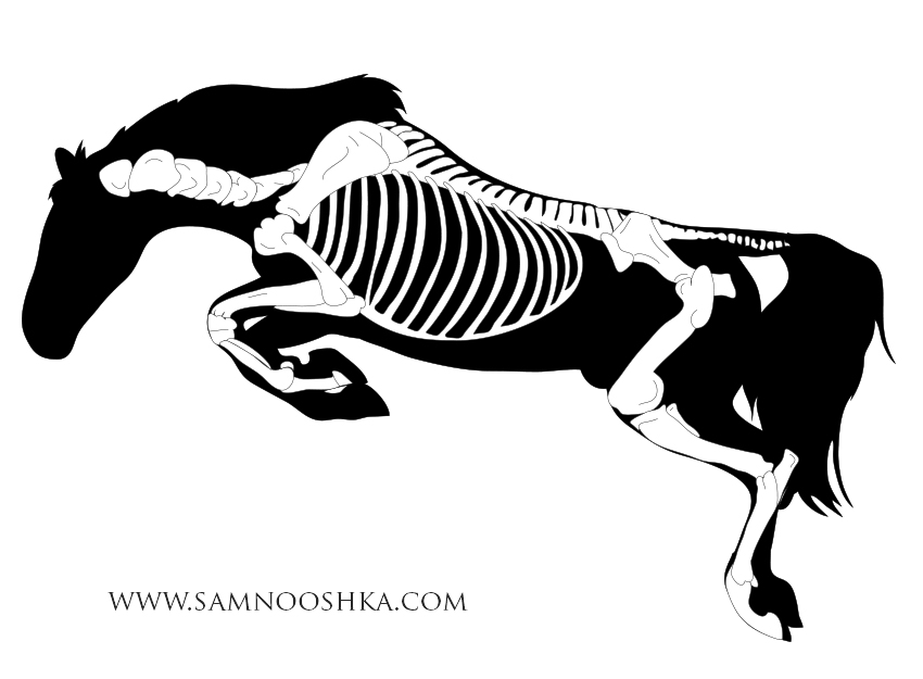
4. Writing added in plain font to give a clean professional feel.
5. A colour change and heartbeat added and it's all finished.
