In April I was asked by Kissy's team (San City High) to design an email flyer to showcase his latest single and up-and-coming projects.

I have designed several email campaigns and if you would like me to design yours, then please get in touch for a quote, outlining what your campaign will be about and provide me with all material and wording.
This campaign was designed for use with Constant Contacts.
For the full sized email (images only) click here: Kissy Email!
For more information on Kissy, please visit his website: http://www.sancityhigh.com/
Logo development is something that I really enjoy. From the interview to the final finished piece. I was contacted by Cheryl to design a logo for her new business, we discussed the idea over the phone, Cheryl had very clear ideas on what she wanted.
Typical questions I ask when designing a logo are:
1. What is the company name?
2. What is it about?
3. Colour scheme?
4. Colours or features to avoid?
We also have an informal chat so I can get a good feel of your personality and your business.
I like to work closely with my clients so that they get exactly what they need.
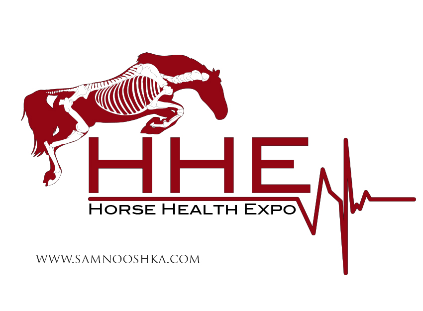
This design had to have a horse jumping, just an outline with a skeleton painted on to it. It had to be clean, with tidy lines and using a basic fairly plain font. Inspiration for the design came from Gillian Higgins "Horses Inside Out".
I like to see how designs come together. Here is a sequence of images to show the development of this design.
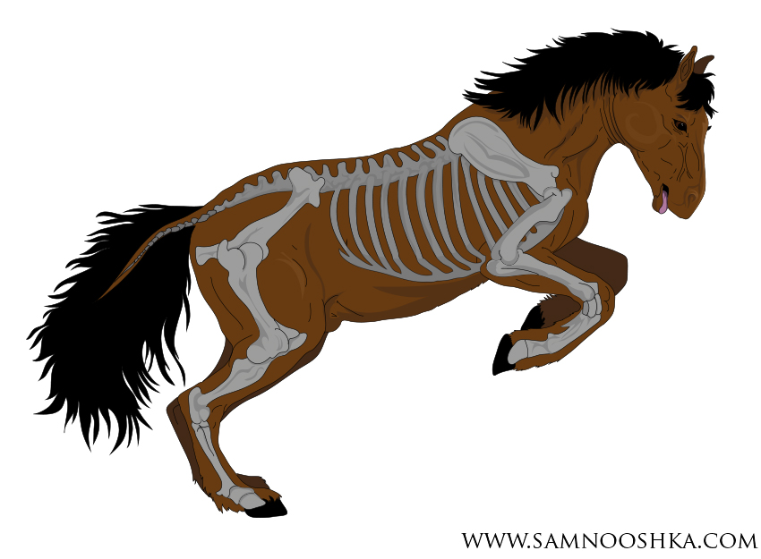
1. Draft 1 - This horse was too cartoon like.
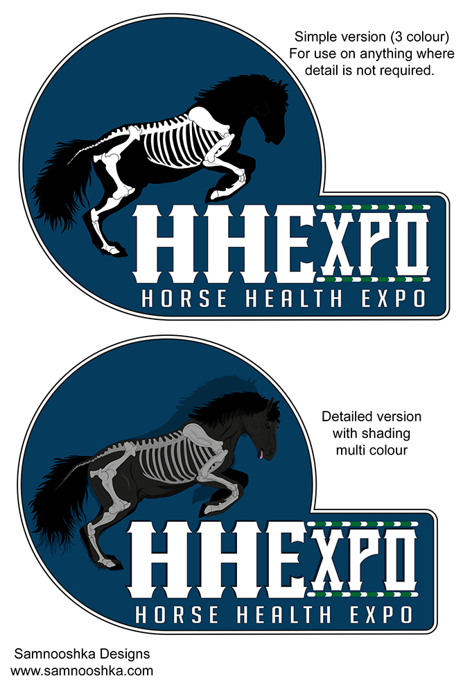
2. I gave the client two options of a detailed version and a plain silhouette. The client preferred the plain version, but wanted the horse to be in a more athletic jumping position and the writing needed to be simpler.
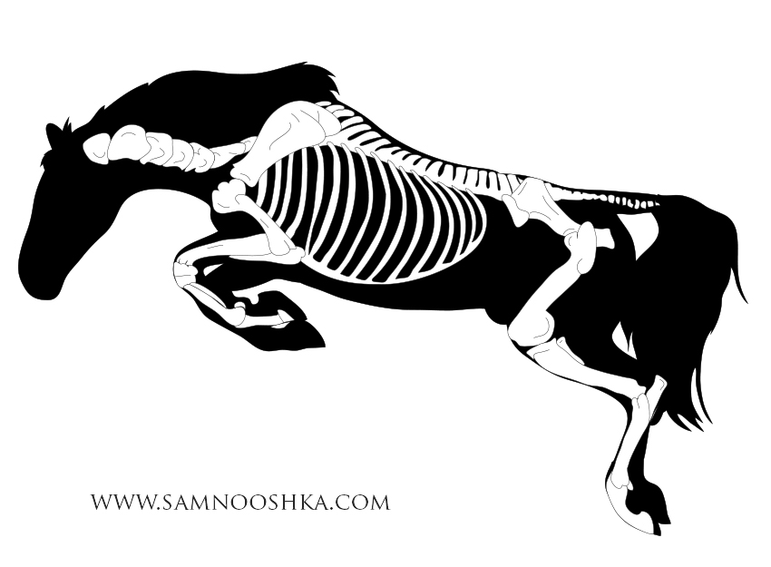
3. I drew a new horse, in a better correct jumping position. He needed to be flipped over to face the other way and the writing added.
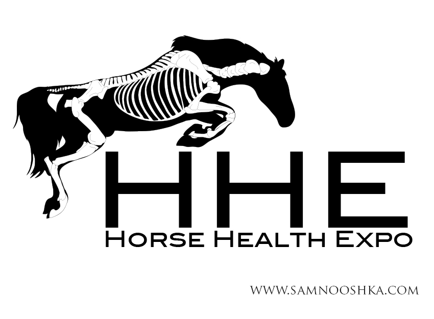
4. Writing added in plain font to give a clean professional feel.
5. A colour change and heartbeat added and it's all finished.
Earlier this month I designed a logo for Fuelled by Aloe. Occasionally, instead of payment for services, I offer a trade of trades to the value of what I am designing. I promised I would also try and blog the progress of how it goes too so here goes:
Some of you know that I have very bad eczema on my left foot after a chemical burn. Having tried everything to help clear it, Julia contacted me to help with a logo design and we discussed possible options about my foot. Sometimes it is so painful it leaves me limping where the skin has dried and cracked (despite regular moisturising) and walking on it is like walking on broken glass.
This week i received my goodies in the post. A Propolis Creme and Forever Aloe Berry Nectar. The aim is to treat the problem from the inside out whilst keeping my foot moisturised.


The Propolis Creme is wonderful, smells amazing and is so silky smooth and cooling. I had to apply extra as my foot absorbed it right away. The creme is thick, unlike a lot of other cremes i had tried and a little goes a long way.
Today i tried the Nectar, the smell is a little off putting, and i am starting slow and building up to the amount recommended. starting at 30ml (half a shot glass) i just pinched my nose and necked it back. Most of the flavour is in the smell, the texture is a little interesting too, but not awful, there is no real after-taste unlike some health drinks i have tried before. Advised it tastes better when it is cold, it had been in the fridge overnight, and being cold certainly helps it go down easier. Overall, texture and taste is something i will get used to, and it is all for the benefit of my poorly foot.
Julia is very helpful and knowledgeable. I love the Aloe products so far and glad to try something natural instead of trying to use harsh medication to combat the eczema. What is also great, is that the Forever Aloe products, come with a 60 day guarantee.

Samnooshka Designs would like to congratulate the winners of the WMOYA awards for 2014-2015 season. For the first time, the AMCUK has run 3 awards, one for rally dogs/bitches, one for weight pull and one for combined. Well done to everyone and thank you to the AMCUK Working Sub Committee for asking us to design their certificates. for the full results of this years WMOYA, please visit the AMCUK website - here.

Some of you may remember a few years ago that we designed some mugs for various rescues. We still have a few left in stock and these are now available on clearance for £4 each (+£3.50 p&p) (reduced from £6.99 each). Discounts available when ordering any 4 or more mugs.
Mugs are individually boxed and posted via courier.
Our chosen rescue is AMCUK Rescue and 10% of all sales of these mugs is donated to rescue.
Mugs available:
| Mug Name | Dog Colour | Writing Colour | Quantity |
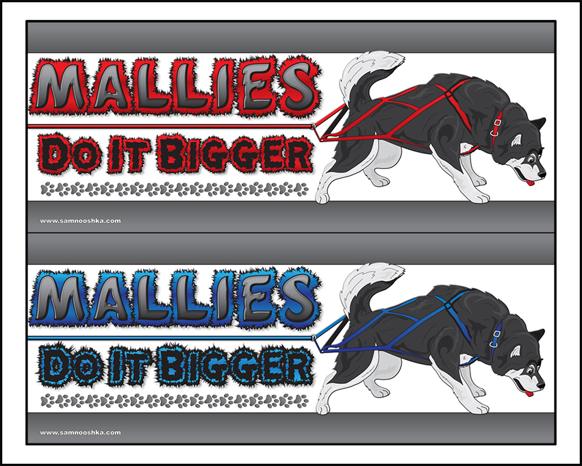
| Mallies Do It Bigger | Black | Red | 4 |
| Mallies Do It Bigger | Black | Blue | SOLD OUT |
| Mallies Do It Bigger | Grey | Red | 10 |
| Mallies Do It Bigger | Grey | Blue | 11 |
| Mallies Do It Bigger | Red | Red | 2 |
| Mallies Do It Bigger | Red | Blue | 1 |
| Huskies Do It Faster | Grey | Red | 4 |
| Huskies Do It Faster | Grey | Blue | 4 |
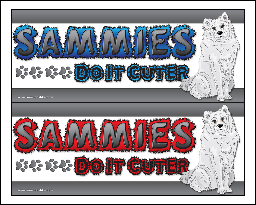
| Sammies Do It Cuter | White | Red | 4 |
| Sammies Do It Cuter | White | Blue | 2 |
| Akitas Do It Proudly | Brown/White | Red | 5 |
| Akitas Do It Proudly | Brown/White | Blue | 5 |
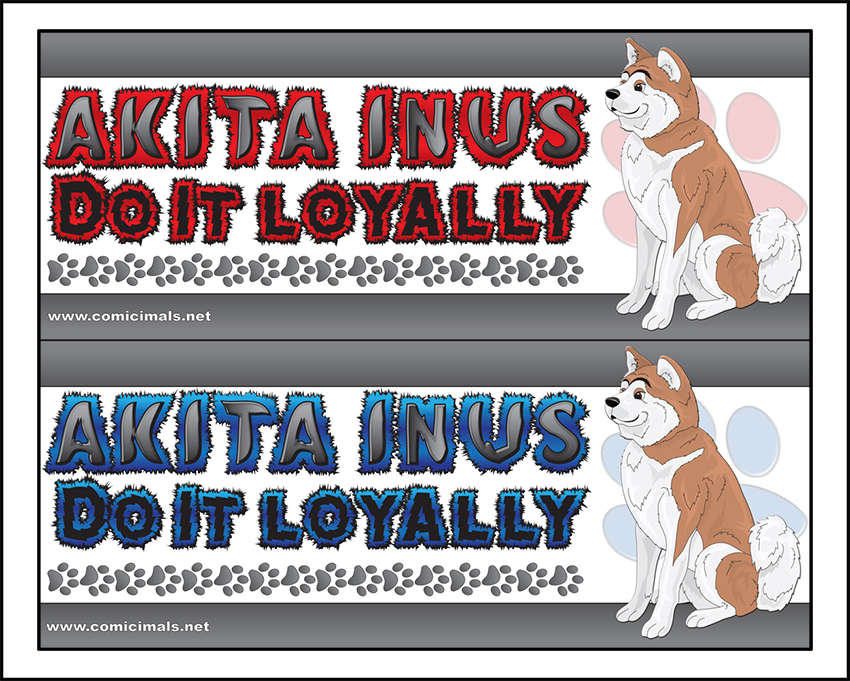
| Akita Inus Do It Loyally | Sandy | Red | 5 |
| Akita Inus Do It Loyally | Sandy | Blue | 5 |



To order your mug, please contact us. Whilst stocks last. Once they're gone, they're gone!!
Julia and Vida Nicholls contacted me for a logo for their aloe vera and bee products. They wanted a design that they could easily have embroidered on clothing and horse blankets and it had to show the athletic side of the business. They wanted a Dog, Horse and Human in the design to show how it can be used on both people and animals.
We created a design that can be used in many ways. The main design features all 3 aspects of the brief, but these can also be used individually to be more specialist. 


Every so often we have a logo design that has been left over from a project. Here is a design that is now for sale for a bargain price of just £30! (£50 normal price)
Insert your company name and your slogan and change the colours to match your business. Included in the final design is the illustrator file, a png and jpg of the design. Fancy a complete company make-over, then we can also design your business stationary to match your design too.

